12 charts to consider with the stock market near record highs 📈
Some context from Wall Street's smartest 📊
Last Friday, the stock market set new record highs, with the S&P 500 closing above 5,000 for the first time ever.
Are we due for a major sell-off?
History says a sharp and lengthy market downturn is unlikely.
Of course, history is also riddled with nuance, and it tells us unsettling short-term drawdowns are pretty typical.
With that in mind, below are some charts from February’s research and commentary that caught my eye.
Record highs are usually followed by record highs 📈
When the stock market sets a new record high after going a while without reaching that point, more record highs tend to follow.
From Ritholtz Wealth Management’s Ben Carlson: “…new all-time highs tend to cluster during upturns. Take a look at this chart of the S&P 500 with new all-time highs plotted in green going back to 1950. … Since 1950, there have been new all-time highs on 6.7% of all trading days. But those percentages have been much higher during bull markets. In the 1990s it was more than 12% of all trading days. After the 1929 highs were finally taken out in 1954, there was a new high in one of every 10 trading days for the remainder of the decade. From 2013-2019, it happened on 14% of all trading days. Despite two bear markets this decade, the S&P 500 has hit new all-time highs on 11% of all trading days in the 2020s.”

For more, read: Stock market: Will it do what it usually does? 🛗
Market milestones are usually followed by new record highs 📈
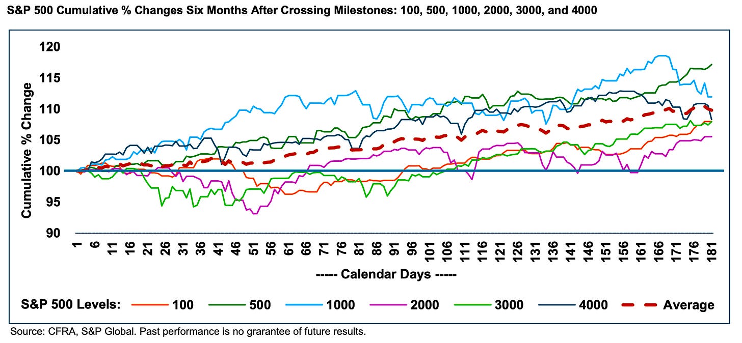
The latest record high also came with an unusual addition: The S&P 500 surpassed a big round number of 5,000.
What’s not unusual is that the market usually continues to set new highs in the months that follow these round-number milestones. From CFRA’s Sam Stovall: “…when looking at the S&P 500’s cumulative return in the 3-, 6-, and 12-months after crossing above the 100, 500, 1000, 2000, 3000, and 4000 levels, the S&P 500 posted average price gains of 4.7%, 9.8%, and 12.3%, and rose in price during 83% of all periodic observations.”
For more, read: Expect revised targets ✏️
Election years tend be good, but less good 📊
Similar to most years, the stock market usually climbs during presidential election years. However, the average election year return has been weaker than the average of all years.
From Goldman Sachs’ Ben Snider: “In the 10 election years since 1984, the S&P 500 generated a median total return of 11% (inclusive of dividends), compared with a median return of 15% across all years since 1984.“
Notably, returns tend to accelerate once election results are in. From Snider: “…regardless of the election outcome, declining uncertainty typically lifts equity valuations and prices following Election Day by more than the typical seasonality would suggest.“
Big intra-year drawdowns are typical 📉
While the stock market tends to trend higher, it can be pretty volatile over short-term periods. This speaks to TKer Stock Market Truth No. 2: You can get smoked in the short-term.
The chart below from JPMorgan Asset Management does a nice job of illustrating this sentiment. Since 1980, the S&P has seen an average annual max drawdown (i.e., the biggest intra-year sell-off) of 14%.

So far, we’ve had a 2% max drawdown in 2024, which is historically modest. That is to say, we would need a much larger drawdown for it to be average.
The good news is that despite all these big drawdowns, history shows that stocks have usually ended each year higher — 33 out of the last 44 times, or three of every four years.
For more, read: The stock market will often fall on its way up 🛗
Companies are increasingly focusing on operating efficiencies 🔧
A big question for big companies is whether or not they’ll be able to maintain high profit margins. One way to bolster margins is by keeping tight controls on costs and expenses through improved operating efficiencies.
Keep reading with a 7-day free trial
Subscribe to 📈 TKer by Sam Ro to keep reading this post and get 7 days of free access to the full post archives.


