
19 charts to consider as markets swing wildly 📈📊📉
It doesn't look great out there. But it's not all bad! 😬

Investors have a lot to think about.
In recent weeks, TKer has spent a lot of time diving into various topics.
But if you’re anything like me, you probably don’t have time to read everything.
So today, I offer a mess of charts that hit most of the big topics on investors minds.
Before we get to those, I’ll note that the tone is one of worry and uncertainty. It might not be what you expected from a newsletter whose mission is to tell the story of how the stock market usually goes up. But “usually” does not mean “always.” And what we’re experiencing right now is a reminder of that.
Having said that, below are 19 charts that caught my eye:
Tariffs are bad for earnings 👎
Every informed person on Wall Street agrees tariffs are bad for the economy, which is bad for corporate earnings. And earnings are the most important driver of the stock market.
Not many historical cases can illustrate this — probably because most of history’s policymakers understood tariffs are bad.
But Societe Generale’s Manish Kabra reviewed what happened to earnings under two historical experiences.
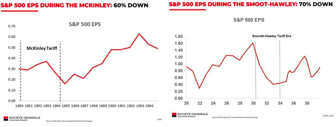
From Kabra’s April 22 note: “The history of high tariffs shows extreme danger: 1890s McKinley Tariff led ~60% EPS drop in S&P 500; 1930s Smoot-Hawley Tariff led 70% drop (World is not like for like but you get the gist).”
The full impact of any new tariffs will depend on their ultimate scope and scale. This includes any hard-to-measure second-order effects, like damage to the American brand abroad.
Keep in mind we can’t rule out the possibility of a swift resolution that comes with minor or short-lived changes to existing trade policy.
